
Brand Guidelines
This brand standards webpage is the final authority in usage, language composition, visual composition, spelling, capitalization, hyphenation and other punctuation and typography — and it’s a source of general information.
Documents for public dissemination must be checked by the Hemp Depot Marketing Department for proper use of logos, trademarks, colors and content style.
Logo & Usage
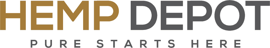
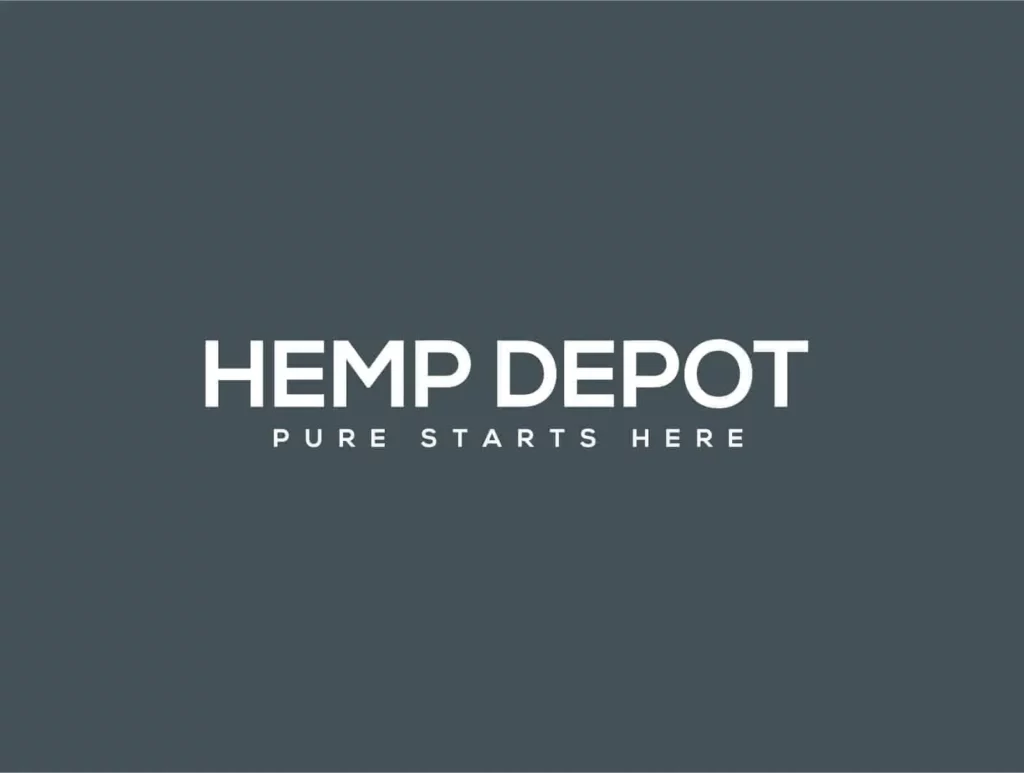
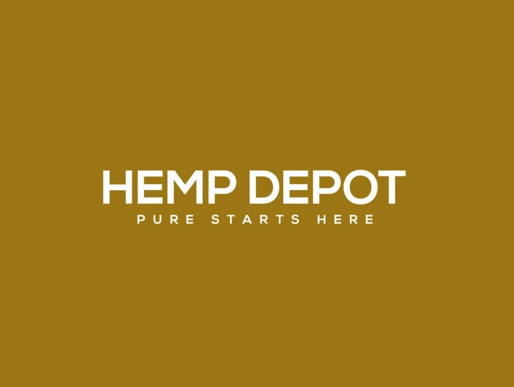
Each of the logos is a representation of Hemp Depot and as such should always remain consistent in clarity, presentation, and representation. The two logo options available provide users with alternative options to best suit various scenarios.
The official logo is uses the Gold for Hemp and Dark Grey for Depot and the tagline under the logo. The colors are not to be switched around, or combined as a gradient.
The tagline should always be present with the logo and never used with out it.
Regardless of which logo is selected, each should be used with caution to ensure a true, unaltered representation of the Hemp Depot logo. All logos should never be turned upside-down, tilted, or skewed from their original orientation.
The elements of the logo should never be broken apart or changed. No additional elements should be added within the logo.
COLORS
Hemp Depot uses two colors.

Gold
HEX – #a57c38
RGB – 165,124,56
CMYK – 32,48,91,11

Dark Grey
HEX – #59585a
RGB – 89,88,90
CMYK – 64,56,53,28
FONTS & TYPE
Headings should always be in all caps using the primary or fallback fonts.
Body copy should always be using the secondary font in standard capitalization formats.
PRIMARY FONT
NEXA BOLD
ALL CAPS
PRIMARY FALLBACK
NEXA BOLD
ALL CAPS
PRIMARY FALLBACK
POPPINS
ALL CAPS
SECONDARY FONT
Open Sans
SECONDARY FALLBACK
Lato
PRIMARY FALLBACK
POPPINS
ALL CAPS